1
2
3
4
5
6
7
8
9
10
11


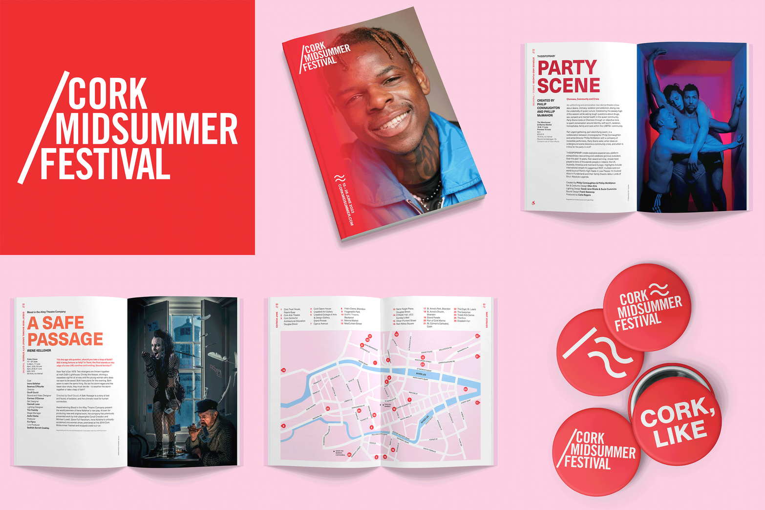
Several years work for Cork Midsummer Festival—an annual multi-disciplinary arts festival that uses the city as its backdrop and inspiration. The city itself is seen as a major performer in the programme, audiences are invited to get underneath its skin. The brief was to capture this, to bring the stories and the history of the city to life, and within that, to give the people of Cork pride and ownership over their festival.
The solution was intuitive – a kinetic, typographic approach utilising a selection of idioms familiar with Cork. Through various communications including programmes, flyers, posters and badges, the sound of the city, of its individuals, was captured and celebrated.
A sense of place is established; voice and accent resonate through the visual language.
The current logo tilts at 23 degrees—as does the Earth towards the Sun on the solstice.